Table of Contents
- Common Banner Design and Printing Mistakes
- Banner Artwork File Setup: Getting Your Design Ready
- Banner Bleed and Safe Area: Protecting Your Content
- Banner Image Resolution: Ensuring Clarity and Sharpness
- Proofreading and Design Review Before Production
- Banner Proof Checklist: Your Final Quality Control
- Selecting Banner Material and Print Settings
- Troubleshooting Common Print Quality Issues
- Frequently Asked Questions
Last Updated: October 19, 2026
Common Banner Design and Printing Mistakes
Banner printing mistakes cost time and money. The good news? Most errors are preventable if you know how to avoid print errors on banners before production starts.
The biggest mistakes fall into a few categories: design flaws, file problems, and material mismatches. A crowded layout kills readability. Poor color contrast makes text disappear. Wrong file formats cause printing delays. Choosing the wrong banner material for your environment guarantees disappointment.
Here's what trips up most people:
- Spelling errors that slip past review
- Text too small to read from the intended viewing distance
- Images with low resolution that print blurry
- Files saved in the wrong color mode for printing
- Artwork without proper bleed and safe margins
- Material choices that don't match the banner's purpose
Learning how to avoid print errors on banners starts with understanding what can go wrong, and building a process to catch it.
Banner Artwork File Setup: Getting Your Design Ready
Your design file is the foundation. A poorly prepared file creates problems at every stage. Before you send anything to print, your artwork needs to meet specific technical requirements.
File Format and Color Mode Requirements
Save your banner design in a format your print shop accepts. Most print providers work with PDF, AI (Adobe Illustrator), or PSD (Photoshop) files. PDF is the safest choice because it preserves all formatting and fonts.
Color mode matters more than most designers realize. Print requires CMYK color mode. If your design is in RGB (the mode used for screens), colors will shift when printed. Reds turn darker. Blues shift purple. Greens look muddy. Convert to CMYK before sending your file.
Here's the simple rule: RGB is for screens. CMYK is for print. Make the switch in your design software before finalizing your artwork.
Large-Format File Specifications
Banner printing is large-format printing. Your file needs to handle the size without losing quality. Most print shops have minimum resolution requirements, typically 150 DPI for banners viewed from a distance, and 300 DPI for banners viewed up close.
File dimensions should match your banner size exactly. If you're printing a 10-foot by 4-foot banner, your file should be 10 feet by 4 feet at the correct DPI. This prevents scaling issues that blur your images or stretch your text.
Check with your print provider about their specific file requirements. Asking upfront saves revision cycles.
Banner Bleed and Safe Area: Protecting Your Content
Bleed and safe margins are technical concepts that prevent printing disasters. Understanding them keeps your important content visible.
Bleed is extra space beyond your final banner edge. When the printer cuts your banner, the blade isn't perfectly precise.
The safe area is the space where your critical content must live.
Think of it this way: your design file is bigger than the final banner. The extra space (bleed) gets trimmed away.
Most design software lets you set up bleed and safe margins as guides. Use them. They prevent last-minute surprises when your banner arrives.
Banner Image Resolution: Ensuring Clarity and Sharpness
Low-resolution images are one of the most common reasons banners look unprofessional. An image that looks sharp on your screen can print blurry at large size.
Resolution is measured in DPI (dots per inch). For banners, follow this rule:
- 150 DPI minimum for banners viewed from 10+ feet away
- 300 DPI minimum for banners viewed up close (under 6 feet)
- 72 DPI is NOT acceptable, this is screen resolution only
Check your image resolution in your design software before sending files to print. If an image is only 72 DPI, enlarging it won't improve the print quality. You need a higher-resolution source image.
When sourcing images, start with the highest resolution available. Stock photo sites offer images at multiple resolutions. Download the largest file size. It's easier to scale down than to scale up without losing sharpness.
Proofreading and Design Review Before Production
This step separates careful work from careless work. Proofreading catches errors that slip past your first glance.
Checking Spelling, Grammar, and Contact Information
Read your banner text out loud. Spell-check tools miss context errors. "Their" versus "there." "Its" versus "it's." Your eyes catch these when you read aloud.
Contact information deserves extra attention. A wrong phone number or email on a banner is worse than no contact info at all. Verify every digit.
Check dates, addresses, and any specific details. If your banner advertises an event on "June 15th," confirm that's correct. If it lists a location, verify the street address.
Have someone else review the text. Fresh eyes catch mistakes you've become blind to after staring at your design for hours.
Verifying Text Readability and Font Sizes
Stand back from your design. Can you read the text from 10 feet away? From 20 feet away? The viewing distance determines the minimum font size.
A general rule: use at least 1 inch of text height for every 10 feet of viewing distance. A banner viewed from 20 feet away needs text at least 2 inches tall.
Test font contrast too. Dark text on a dark background disappears. Light text on a light background is invisible. Check your color contrast in your design software or use an online contrast checker.
Banner Proof Checklist: Your Final Quality Control
A proof is your last chance to catch errors. Request a proof from your print provider before they print the full run.
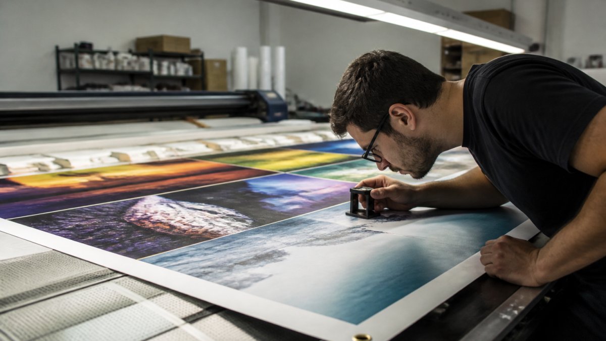
Review your proof against this checklist:
- All text is spelled correctly
- Contact information is accurate
- Images are sharp and clear, not blurry
- Colors match your brand standards
- Text is large enough to read from intended viewing distance
- No important content is cut off at edges
- Background colors are consistent
- Logo appears crisp and properly sized
- No unexpected banding or color shifts
- Layout is balanced and not crowded
If anything looks wrong, request corrections before final printing. Changes at the proof stage are cheap. Reprinting after production is expensive.
Selecting Banner Material and Print Settings
The material you choose affects durability, appearance, and how your banner holds up in its environment.
Material Selection for Durability and Appearance
Vinyl banners are the standard for outdoor use. They're weather-resistant, durable, and affordable. Vinyl handles sun, rain, and wind without degrading quickly.
Canvas offers a premium look for indoor events. It's heavier and more formal than vinyl. Canvas works well for trade shows and upscale venues.
Mesh is ideal for windy environments. The material lets air pass through instead of catching wind like a sail.
Fabric banners work for indoor displays where you want a soft, elegant appearance. Fabric is less durable outdoors but looks professional indoors.
Choose material based on where your banner will live. An outdoor banner in a parking lot needs vinyl.
Color Contrast and Visibility Across Viewing Distances
Color contrast determines whether people can read your banner. High contrast between text and background makes reading effortless. Low contrast makes text hard to read even up close.
Test your color combinations:
- Black text on white background: excellent contrast
- Dark blue text on light gray background: good contrast
- Red text on dark background: poor contrast
- Yellow text on white background: poor contrast
Use an online contrast checker tool to verify your color pairing meets accessibility standards. A contrast ratio of 4.5:1 is the minimum for readable text (Understanding Success Criterion 1.4.3: Contrast (Minimum) | WAI).
Consider viewing distance too. Colors that look distinct up close can blend together from far away. Red and green look similar at distance. Blue and black merge together. Test your banner design at the actual viewing distance if possible.
Troubleshooting Common Print Quality Issues
Even with careful planning, print quality problems happen. Knowing what causes them helps you fix them fast.
Banding Lines and Print Pass Problems
Banding appears as horizontal or vertical lines across your banner. The lines usually indicate a printer maintenance issue, not a design problem.
Banding happens when the printhead isn't making proper contact with the banner material. This occurs when:
- The printhead is clogged or dirty
- The printer needs calibration
- The banner material is wrinkled or misaligned
- The print passes are set incorrectly
A print shop addresses this by running a nozzle check and cleaning the printhead. If you're printing in-house, consult your printer manual for the cleaning procedure.
Feed calibration can also cause banding. The printer feeds the material through at slightly wrong angles. The print shop recalibrates the feed system to fix this.
When to Request a Reprint or Contact Your Print Provider
Not every printing issue requires a reprint. Some problems are minor and acceptable. Others mean the banner is unusable.
Request a reprint if:
- Text is blurry or unclear
- Colors are significantly different from your approved proof
- The banner is cut off or not centered
- Banding lines are visible across large areas
- The banner material is damaged or wrinkled
Don't request a reprint for:
- Minor color shifts (printing can't match screen colors perfectly)
- Slight variations in text position (within 1/8 inch is normal)
- Small imperfections at edges (these get trimmed)
When contacting your print provider about issues, have your original design file and approved proof ready.
At C3 DesignsBiz, we catch most problems during the proof stage. Our team reviews files for common mistakes and alerts you before production starts.
Getting your banner right the first time saves money and stress. The steps outlined here catch errors before they become expensive problems.
Ready to print your banner? C3 DesignsBiz handles the technical details so you don't have to.
| Common Print Problem | Likely Cause | How to Fix |
|---|---|---|
| Blurry images | Low resolution (under 150 DPI) | Resupply higher-resolution image source |
| Color shift | RGB file instead of CMYK | Convert design to CMYK before sending |
| Text cut off | No safe margin set | Reposition text away from edges |
| Banding lines | Printhead clog or misalignment | Request printhead cleaning or calibration |
| Crowded layout | Too much content | Remove non-essential elements or enlarge banner |
| Poor text readability | Font too small | Increase font size based on viewing distance |
Frequently Asked Questions
What resolution should banner artwork be to avoid blurry images?
Banner artwork should be 100-150 DPI (dots per inch) for large-format printing. At typical viewing distances of 6-10 feet, lower DPI is acceptable compared to print materials viewed up close. Always confirm the exact DPI requirement with your print provider, as it depends on banner size and material. Files submitted at 72 DPI will appear pixelated; 300 DPI is unnecessary for banners and creates oversized files.
How do you prevent colors from looking different in print than on screen?
Request a color proof before full production. Submit your design in CMYK color mode (not RGB), which matches what large-format printers actually produce. Discuss color management and proofing options with your print provider, many offer digital or physical proofs to verify color accuracy. Lighting conditions and monitor settings affect how colors appear on screen, so a proof catches discrepancies before printing your entire banner.
What should you check on a banner proof before approving it?
Use a banner proof checklist to verify spelling and grammar, confirm all contact information is correct, check that text and logos are not cut off at edges, review color accuracy and contrast, ensure images are sharp and not pixelated, and confirm the layout matches your design file. Pay special attention to the safe area, content within the safe margin will definitely print, while content near bleed edges may be trimmed.
How do you keep text and logos from being cut off on a banner?
Place all critical content within the safe area, typically 0.5 inches from the trim edge. Understand bleed and safe margin requirements before designing. Test your file by viewing it at 100% zoom and checking edges carefully. If using a print provider, ask for their specific safe area guidelines, they vary by printer and material. A preflight checklist helps catch edge issues before production.