

Table of Contents
- Step 1: Define Your Audience and Campaign Goal Before You Design
- Step 2: Choose the Right Size and Format for Your Marketing Flyers
- Step 3: Build Visual Hierarchy With Layout, Color, and Typography
- Step 4: Write Copy That Converts: Headline, Body, and Call to Action
- Step 5: Use Business Flyer Examples and Marketing Flyer Templates as Starting Points
- Step 6: Prepare Your File for Print: Resolution, Bleed, and Color Mode
- Step 7: Understand Flyer Printing Cost and Choose a Print Method
- Step 8: Distribute, Test, and Measure Your Flyer Campaign
- Frequently Asked Questions
Last Updated: October 7, 2026
Step 1: Define Your Audience and Campaign Goal Before You Design
Most marketing flyers fail before anyone opens a design tool. The problem starts with a missing brief.
Marketing flyers are single-page print or digital documents used to promote a business, event, or offer to a specific audience. They work best when the designer knows exactly who will read them and what action that reader should take.
So before you touch a template, answer three questions:
- Who is this flyer for? (age, location, buying habits)
- What is the one action you want? (call, visit, scan, RSVP)
- Where will people see it? (counter, mailbox, feed, bulletin board)
A single clear goal, like "drive 50 RSVPs," shapes every choice that follows.
Step 2: Choose the Right Size and Format for Your Marketing Flyers
The right flyer size depends on where it will live. A handout needs a different shape than a poster on a wall.
Standard flyer dimensions and when to use each
| Size | Best For | Notes |
|---|---|---|
| 8.5 x 11 in | Mailers, handouts, counter stacks | Fits standard paper and folders |
| 5.5 x 8.5 in | Rack cards, inserts, event programs | Cheaper to print in bulk |
| 11 x 17 in | Window displays, event signage | Needs bolder type to read at distance |
| 4 x 6 in | Postcards, quick promos | Low postage, high scan rate |
Print vs. digital flyer formats
Print flyers use CMYK color and need bleed. Digital flyers stay in RGB and get sized for screens, usually square or vertical for social feeds. If you plan to do both, design for print first, then export a digital version.
The U.S. Postal Service mailing guidelines list exact size and weight rules if you plan to mail your flyers. Check them before you commit to a size.
Step 3: Build Visual Hierarchy With Layout, Color, and Typography
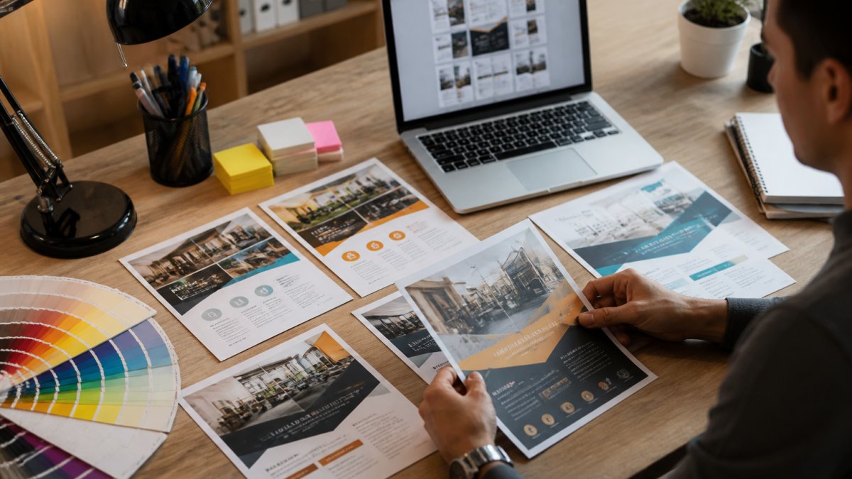
Visual hierarchy is the order in which a reader's eye moves across your flyer. Get it right and people absorb your message in seconds. Get it wrong and they toss the page.
Layout and composition basics
Use a grid. Place your headline at the top, a strong image in the middle, and your call to action at the bottom. Leave white space so elements can breathe. Crowding is the most common mistake we see in submitted files.
Color palettes, contrast, and font pairing
Pick two or three colors from your brand identity. High contrast between text and background keeps copy readable. For font pairing, use one bold font for the headline and one clean font for body copy. Never use more than two fonts on a single flyer.
Step 4: Write Copy That Converts: Headline, Body, and Call to Action
Copy does the selling. Design only makes people stop long enough to read it.
Structure your flyer copy in three layers:
- Headline: One clear benefit, under 10 words
- Body copy: Two or three short lines of supporting detail
- Call to action: One specific instruction, like "Call today" or "Scan to RSVP"
Skip the jargon. Write like you talk. A headline that says "Half-Price Oil Change This Week" beats "Comprehensive Automotive Maintenance Solutions" every time.
Step 5: Use Business Flyer Examples and Marketing Flyer Templates as Starting Points
Templates save time, but only if you pick the right one and customize it properly.
What to look for in a template
Good marketing flyer templates share a few traits:
- A clear grid you can edit without breaking
- Layered files so you can swap images and text
- Space reserved for your logo and contact info
Customizing templates without losing brand identity
Swap in your brand colors and fonts. Replace stock images with real photos of your team, product, or venue. Keep your logo in the same spot on every flyer so repeat customers recognize your materials at a glance.
Step 6: Prepare Your File for Print: Resolution, Bleed, and Color Mode
Most print files get rejected for reasons that have nothing to do with design talent. They fail on technical setup. Here is what to check before you send anything to a printer.
Resolution and image quality
- 300 DPI at final print size is the standard for print. A 72 DPI web image will look soft or pixelated on paper.
- Resolution is tied to physical size. A 300 DPI image that is 4 inches wide becomes 150 DPI if you stretch it to 8 inches. Always check the effective resolution after scaling.
- Vector files (logos, icons) scale infinitely and never lose quality. Raster files (photos) do not.
Bleed, trim, and safe margins
These three zones are the most misunderstood part of print setup:
- Bleed: 0.125 in of extra artwork beyond the trim line on all four sides. Without it, any background color or image that touches the edge will show a thin white sliver after cutting.
- Trim line: where the printer cuts. Your design should extend past it, not stop at it.
- Safe margin: keep all text and logos at least 0.125 in inside the trim line. Anything closer risks being clipped by normal cutting variance.
A common pattern is a flyer that looks perfect on screen but loses the bottom of its call to action because the text sat inside the bleed zone.
Color mode and ink coverage
- CMYK for print, RGB for screens. Colors shift when converted, so design in CMYK from the start if the flyer is print-first.
- Rich blacks (mixing all four inks) can smudge and take longer to dry. Use a standard black for body text.
- Total ink coverage above roughly 300% can cause set-off and drying problems on some paper stocks.
Paper stock and finish
Paper choice changes how a flyer feels and how long it lasts:
| Stock | Weight | Best For |
|---|---|---|
| Standard gloss text | 80-100 lb | High-volume handouts, mailers |
| Matte text | 80-100 lb | Readable copy, write-on surface |
| Uncoated cover | 80-100 lb | Premium feel, easy to write on |
| Cardstock | 100 lb+ | Rack cards, postcards, keepsakes |
Finish matters too. Gloss makes colors pop but shows fingerprints. Matte reads better under bright light. Aqueous coating adds scuff resistance for flyers that get handled a lot.
Proofing before you commit
- Request a digital proof (PDF) to check layout, fonts, and color breaks.
- Request a hard proof for any job where color accuracy is critical, like brand-matched packaging or event signage.
- Print one copy on your own printer first. It will not match the final output, but it catches typos, missing bleeds, and layout errors before you pay for a full run.
The Adobe guide to print resolution and bleed walks through these settings if you are new to print files. Send a test file before your real deadline.
Step 7: Understand Flyer Printing Cost and Choose a Print Method
Flyer printing cost depends on quantity, paper stock, size, and turnaround speed. Rush jobs cost more. Bulk orders cost less per unit.
Compare your main options:
| Method | Best For | Trade-off |
|---|---|---|
| Digital printing | Small batches, fast turnaround | Higher per-unit cost |
| Offset printing | Large runs, 1,000+ | Lower unit cost, slower setup |
| Same-day printing | Urgent events, trade shows | Premium price for speed |
Ask for a quote with your exact quantity, size, and deadline. Pricing depends on those details, so a generic number will mislead you. For current rates, check C3 DesignsBiz's website or request a quote directly.
Step 8: Distribute, Test, and Measure Your Flyer Campaign
A flyer only works if people see it and act. That means planning distribution, building in tracking, and running a real test before you commit to a full print run.
Choose distribution channels that match the goal
Where the flyer lives should drive how it is designed and how it is tracked:
- Direct mail: Use a mailing list, check size and weight rules, and expect a slower response curve. The U.S. Postal Service mailing guidelines list exact size and weight rules if you plan to mail your flyers.
- Counter and lobby stacks: High volume, low cost, but hard to attribute. Use a dedicated QR code per location.
- Bulletin boards and community spaces: Best for local events. Include a tear-off tab or a short link.
Adapt the flyer for digital channels
A print flyer dropped into a social feed usually fails. Fix it before you post:
- Resize for the platform. Square (1:1) for feed posts, vertical (9:16) for stories and reels.
- Check contrast. Light gray text on a white background that reads fine in print can disappear on a phone screen in daylight. Aim for strong contrast between text and background.
- Use readable type sizes. Body text below roughly 14 px is hard to read on mobile.
Build tracking into the design
Tracking has to be planned before the flyer is printed, not after:
- Unique QR code per flyer or location. Route each to a different landing page so you know which placement drove the scan.
- Short link with a UTM tag for any digital version.
- Promo code tied to the flyer only. If the code shows up in a campaign report, you know the flyer drove it.
Run a real test
A test only means something if you change one thing at a time:
- Pick one variable: headline, image, offer, or call to action.
- Print two versions that differ only in that variable.
- Distribute them to comparable audiences for the same length of time.
- Compare response rates using the tracking above.
- Roll out the winner and test the next variable.
Testing two things at once tells you nothing about which one caused the change.
Review before you print or publish
Run this checklist every time:
- Read the flyer out loud to catch awkward phrasing.
- Check every phone number, address, URL, and date.
- Confirm the offer terms match what you can actually deliver.
The Federal Trade Commission's advertising guidance covers what you can and cannot claim in your promotional offer. Read it before you print anything with a discount or guarantee.
Once you know which version wins, roll it out at scale. Then repeat the test with your next campaign.
Frequently Asked Questions
What size should a business flyer be?
The most common size is 8.5 x 11 inches, which works for most business promotions and event handouts. Half-page flyers (5.5 x 8.5 inches) cost less to print and fit easily in racks or on bulletin boards. For maximum impact, 11 x 17 inches works as a small poster. Choose based on where you will distribute it and how much information you need to include.
What information should a marketing flyer include?
Every professional marketing flyer needs a clear headline, a brief description of your offer or event, your business name and logo, and a strong call to action. Include contact details such as phone, website, or a QR code. If you are promoting an event, add the date, time, and location. Keep body copy short so the reader can scan it in seconds.
How much does it cost to print 1,000 flyers?
Flyer printing cost depends on size, paper stock, ink coverage, and turnaround time. Full-color flyers on standard paper usually cost more per piece in small batches and less per piece as quantity increases. Same-day or rush printing adds to the total. Request a quote from your printer with your exact specifications for an accurate figure.
How do you choose colors and fonts for a flyer?
Start with your brand colors so the flyer matches your other materials. Use one bold color for the headline and call to action, and keep the background neutral for contrast. Limit yourself to two fonts: one for headings and one for body copy. Sans-serif fonts like Arial or Helvetica are easy to read at a distance and in small sizes.
Getting a flyer designed, printed, and delivered on a tight deadline is where most projects stall. C3 DesignsBiz handles same-day custom design, premium printing, and fast nationwide turnaround, so your flyers, posters, and banners arrive ready for the event. Get started with C3 DesignsBiz and put professional marketing materials in your hands without the wait.